The Brush Flo | Miniature Painting Portfolio & Commissions
Miniature Painter & Warpstone digger
Portfolio of my miniature painting projects
Paintings
Here you'll find the latest projects I'm working on
Blood Bowl: When Halflings Defy the Laws of Physics (and Common Sense)


Some projects stick with you. Not because they’re perfect, but because they’re crazy. My Blood Bowl team is one of them. A mix of badly shaven halflings, red noses, and potbellies, backed up by towering treemen who look like they wandered out of a cursed forest. Absurd? Completely. Brilliant? Absolutely.---The Core Idea: Absurdity as a ConceptBlood Bowl is a game where anything goes, especially dark humor and anachronisms. The idea of seeing halflings—those peaceful little folks who love food and naps—throw themselves into an ultra-violent sport is already hilarious. But painting them as determined warriors (or at least excited little runts), with faces flushed from exertion (or beer), patchy beards, and expressions somewhere between terror and enthusiasm was a challenge I couldn’t resist.- The faces: I played up the pink and red tones on their cheeks and noses, as if they’d just run a marathon (or drained a keg). Their wide-eyed, gap-toothed grins make it look like they still don’t grasp the sheer carnage awaiting them.
- The textures: I emphasized the wrinkles in their clothes, the mud stains, and the misshapen armor (because finding halfling-sized gear must be a nightmare).
- The details: Bottles hanging from their belts, picnic baskets (just in case), and makeshift mouthguards. Because even in the arena, snack time is sacred.---


The Treemen: The Literal Guardians of the TeamBehind this band of little maniacs stand the treemen. Rooted, bark-covered giants with glowing blue eyes that seem to say: “Why me?” They’re there to protect (or at least try), but mostly to contrast with the surrounding chaos.- Painting: I went for natural tones (browns, mossy greens) with blue glows on their runes and eyes to give them a mystical touch.
- Poses: They look resigned, as if they know this halfling team is some kind of cosmic joke. Yet, they stay. Out of loyalty? Boredom? No one knows.---The Overall Effect: A Team That Shouldn’t ExistOn the pitch, the effect is instant:
- On one side, halflings running every which way, flailing their tiny arms as if it could change anything.
- On the other, motionless treemen, like giant pub bouncers, watching the mayhem with a mix of pity and amusement.It’s funny. It’s ridiculous. And that’s exactly what makes Blood Bowl so charming.---Why Blood Bowl (and This Team in Particular)?I’d never really paid much attention to Blood Bowl until I played it. Then one day, I tried Blood Bowl 7, with its split-team system, chaotic rules, and juvenile humor. And I loved it.- The game: It’s American football, but more violent, more random, and with magic. The dice hate you, opponents crush you, and yet, you’ll come back for more.
- The painting: It’s a playground with no limits. You can dare to do anything: flashy colors, over-the-top poses, ridiculous details. Because in the world of Blood Bowl, anything goes.---A Word of Advice for the CuriousIf you’ve never tried Blood Bowl, give it a shot. Pick an improbable team (halflings, goblins, chaotic dwarfs), and have fun. Paint them like they’re straight out of a cartoon, play like every match is your last.Because Blood Bowl is all about that: a game where absurdity rules, where strategy mixes with sheer luck, and where even the smallest can (theoretically) win
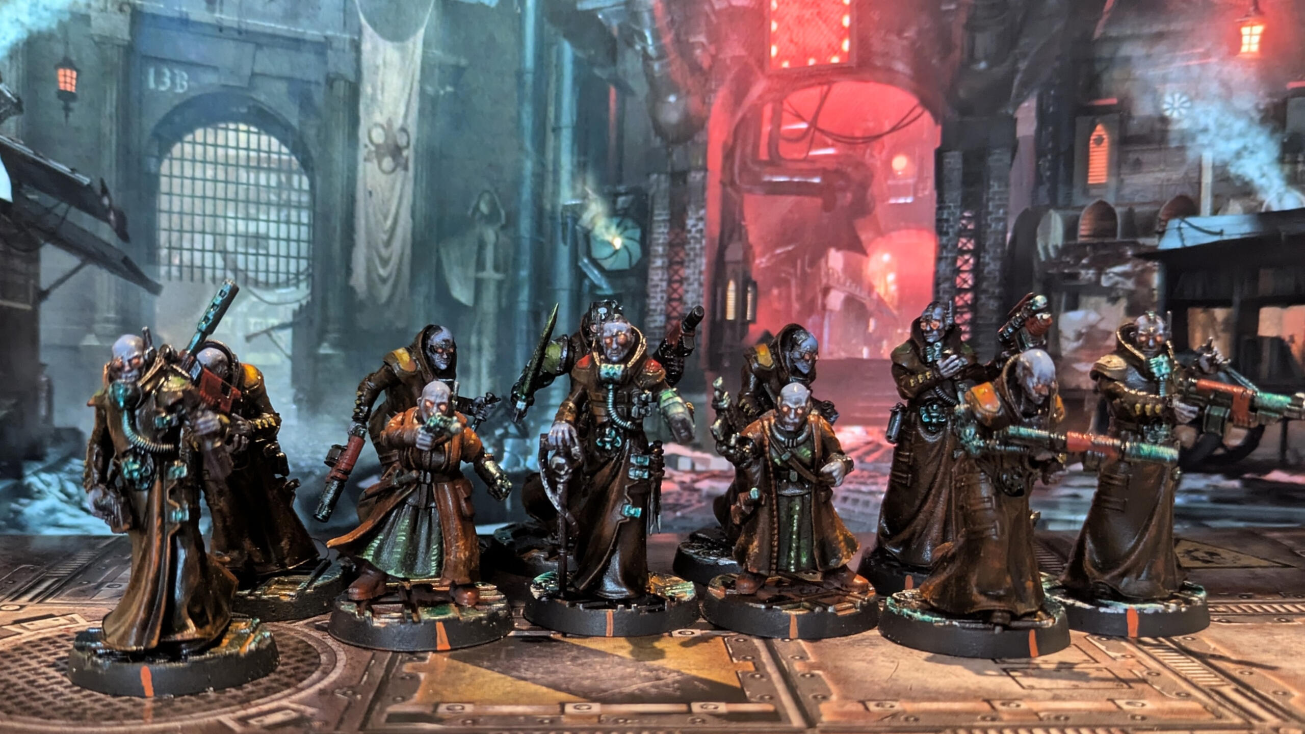
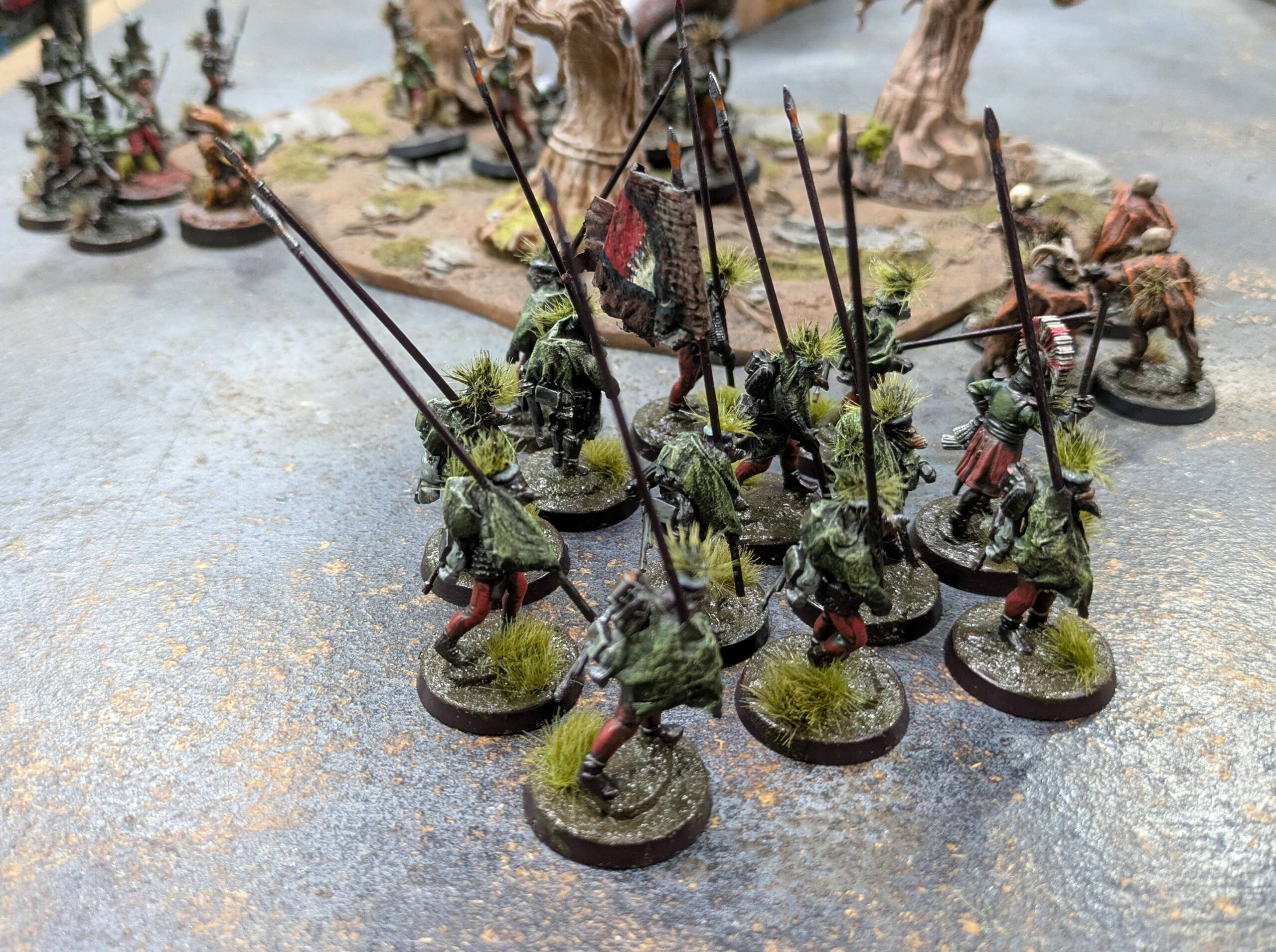
The Skaven of Shadow: When Orange Becomes Rust and Blood
There’s something deeply satisfying about painting Skaven. Maybe it’s because they’re ugly, vicious, and unpretentious—a lot like my first attempts at painting them ten years ago. Back then, I slapped paint on them without really understanding colors or techniques. Today, I approach them differently: with an orange base layer, aggressive brushstrokes for the reds and greens, and rusted metals applied with a sponge. The result? An army that looks like it crawled straight out of the sewers of Skavenblight, covered in rust, dried blood, and that unnatural greenish glow so characteristic of things that shouldn’t exist.The idea was to create a contrast between the Skaven’s bright colors and the dark green of the forest, as if they were emerging from a cursed swamp.


Why It WorksThis scheme isn’t complicated, but it’s effective:
- The orange provides a bright foundation that makes the other colors stand out.
- The brushstrokes on the red and green create movement and texture, as if the Skaven are in perpetual motion.
- The rusted metals add gritty realism, perfect for an army of rats.
- The bases tell a story: these Skaven aren’t just placed on a table—they come from somewhere—a dark, damp, and hostile place.---Evolution… or NotTen years ago, my Skaven looked like poorly placed splotches of color. Today, they have character, texture, and a strong visual identity—while still being quick to paint. I didn’t revolutionize my technique; I just refined it: less time spent chasing perfection, more time playing with contrasts and effects.And that’s the beauty of Skaven: even when poorly painted, they remain magnificent… because they’re supposed to be.
Blood Angels: Where Art Meets Restraint


There’s something deeply compelling about the Blood Angels. Not just their fearsome reputation or their cursed gene-seed, but their struggle with emotion—a battle they wage not only on the field but within themselves. Their reliance on art, poetry, and craftsmanship to tame the Red Thirst resonates with me in a way few factions do. Painting them isn’t just about capturing their gothic grandeur or their blood-soaked armor; it’s about channeling that tension between discipline and fury, between beauty and brutality.---The Sanguinary Guard: A Study in Golden RestraintThe Sanguinary Guard were a challenge, but not just because of their intricate armor or their angelic, terrifying presence. It was the Non-Metallic Metal (NMM) gold that pushed me. Gold is tricky—too bright, and it looks garish; too muted, and it loses its luster. But for the Blood Angels, it had to be just right: regal, but not ostentatious; radiant, but not blinding.
It’s not the gold of kings—it’s the gold of warriors who have seen too much, who carry the weight of their primarch’s curse and their own fragile humanity.---The Wings: A Symbol of DualityThe wings were where I really wanted to capture their dual nature. They’re not just decorations; they’re a manifestation of their struggle—both angelic and monstrous.
individual but part of a whole, like the fragile balance the Blood Angels maintain between nobility and savagery.---Why It MattersPainting the Blood Angels isn’t just about getting the colors right. It’s about understanding their soul. They’re warriors and artists, saints and monsters. Every brushstroke was an attempt to capture that duality—the beauty they create to keep the beast at bay, and the beast itself, always lurking, always hungry.And in the end, that’s what makes them so fascinating. They’re not just space marines. They’re tragic heroes, using art as their shield against the darkness within.


Forbidden Psalm: Where Madness Meets Miniatures
There are games that follow the rules, and then there’s Forbidden Psalm—a game that rewrites them. From the moment I cracked open the box, I knew this was something different. Not just another skirmish game, but a playground for creativity, a celebration of chaos, and a love letter to the weird, the grim, and the gloriously unpredictable.
A Breath of Fresh, Rotten Air
Forbidden Psalm hit me like a gust of wind through a cracked crypt door. In a hobby that can sometimes feel constrained by lists, meta, and rigid lore, this game is a bowl of fresh, rotting air. It’s Monty Python meets death metal: absurd, brutal, and unapologetically fun. The world is ending. There’s no hope, no grand destiny—just five miserable souls trying to scrape by in a land that’s already dead. And that’s what makes it so damn liberating.


Roll the Dice, Embrace the Chaos
The game starts with a roll of the dice. Not just for stats, but for everything: names, personalities, quirks, and even how your warband stumbles through the apocalypse. One minute you’re a disgraced knight with a drinking problem; the next, you’re a melted-faced sorcerer who really, really should be dead but isn’t (because the dice said so). It’s D&D vibes meets grimdark survival horror, where the only rule is that there are no rules—just consequences.
Kitbashing: The Art of "What If?"
With Forbidden Psalm, the bitz box becomes your best friend. The game demands kitbashing. It rewards madness. That old Empire captain with a torch? Now he’s a last light in the dark, his flame the only thing keeping the horrors at bay. That failed experiment of a sorcerer with half his face missing? He’s cheated death one too many times, and it shows.
I raided my stash for spare heads, weapons, and random junk—a broken lantern here, a skull there, a mysterious pouch that might hold salvation (or just more problems). The result? A warband that looks like they crawled out of a nightmare—which, given the setting, is exactly the point.Painting the End Times
The atmosphere of Forbidden Psalm is grim, dark, and dripping with character. This isn’t a world of shining heroes; it’s a world of desperate survivors, where every scar, every rusted nail, and every glowing runic tattoo tells a story.
Why You Should Try It
If you love:
✅ D&D’s storytelling but want something faster, bloodier, and funnier.
✅ Kitbashing without limits or lore constraints.
✅ Grimdark with a twist of humor (because if you can’t laugh at the apocalypse, what can you laugh at?).
✅ Games that encourage you to break the rules and make your own.
Then Forbidden Psalm is for you.
It’s not about winning. It’s not even about surviving. It’s about telling a story—one where the heroes are flawed, broken, and probably doomed, but damn if they don’t go down swinging.
Rohan on the Table: A Quick Ride Through Paint and Experimentation
I painted this Rohan army a while back, during one of those periods where you just want to try something new without overthinking it. No grand masterplan, no meticulous color theory—just a few ideas, some brushes, and a desire to see these riders come to life.---Green and Yellow: A Happy AccidentI started with the classic Rohan green. It’s a safe choice, but I wanted a bit more energy. So, I grabbed an acid yellow for the highlights, almost on a whim. The contrast was way stronger than I expected—almost jarring at first. But then, it kind of worked. The green kept that earthy, Rohirrim feel, while the yellow made the miniatures pop, like sunlight breaking through storm clouds. To tie it all together, I slopped on a green glaze over everything. It softened the clash just enough, making the colors feel intentional rather than chaotic.---Leather, Cloaks, and Quick BrushstrokesI didn’t want to spend hours blending. Instead, I used quick, directional brushstrokes to suggest the texture of leather and the folds of cloaks. It’s not perfect, but it gives the impression of movement and wear—like these guys have been riding hard for days. The leather straps and boots got a similar treatment: a base of brown, a few highlights, and some streaks to mimic scuffs and creases. Nothing fancy, just enough to make it look lived-in.---
Horses: Sponge and SpeedFor the horses, I didn’t want to get bogged down in details. A sponge became my best friend. Dabbing on layers of paint created a rough, fur-like texture without the fuss. It’s not hyper-realistic, but it gets the job done and keeps the focus on the energy of the models.---Bases: Dirt, Herbs, and a Bit of LuckThe bases were an afterthought, really. I slapped on some brown paint, sprinkled dry herbs for texture, and then came the fun part: a rust-orange pigment wash mixed with alcohol. I wasn’t sure how it would turn out, but it settled into the cracks and created this dusty, weathered look—like the riders had just galloped through the plains of Rohan. It’s simple, but it ties the whole army together and gives them a sense of place.---No Pressure, Just PaintingThis project wasn’t about perfection. It was about playing with colors and techniques, seeing what worked and what didn’t. Some parts turned out better than others, but that’s part of the fun. The goal was to create an army that felt right on the table, one that captured the spirit of Rohan without getting lost in the details.---


Why It Worked (For Me, At Least)Sometimes, the best projects are the ones where you let go of expectations. This army isn’t flawless, but it’s full of character. The bold colors, the rough textures, the quick-and-dirty bases—they all add up to something that feels alive.If you’re thinking about painting your own Rohan force, my advice is simple: don’t stress. Try something new, embrace the mistakes, and enjoy the process. After all, the Riders of Rohan weren’t about perfection—they were about speed, courage, and a little bit of recklessness.
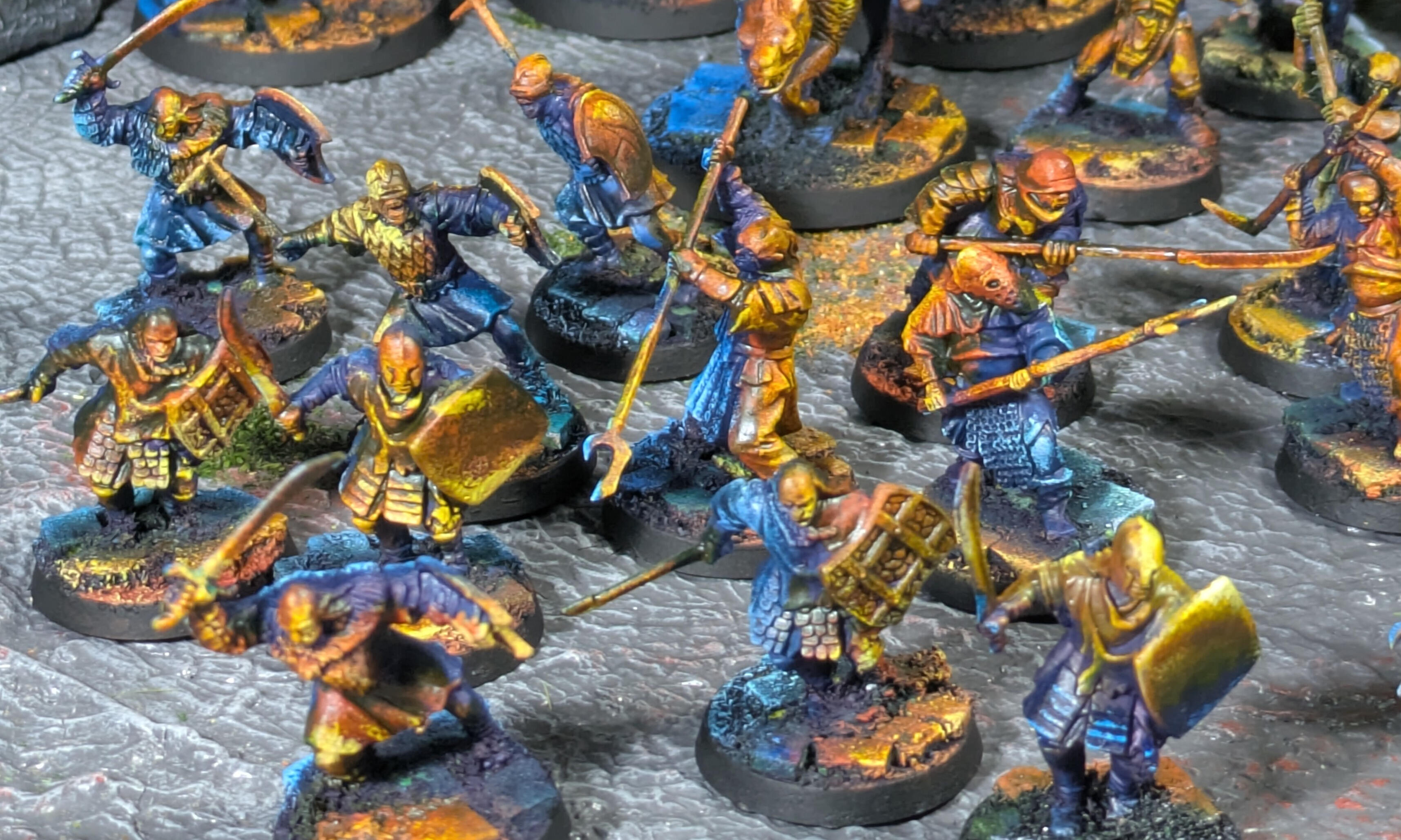
Army of the great eye
There is something fascinating about an army that seems to have emerged straight from the darkness of Middle-earth. An army that doesn’t just represent warriors, but embodies fear, destruction, and the malevolent power of Sauron. Today, I present my Mordor army for The Lord of the Rings Strategy Battle Game, a collection of miniatures painted with a radical artistic approach: bichromy and Object Source Lighting (OSL). No endless gradients, no hyper-realistic textures. Just striking contrasts, plays of light, and an atmosphere that chills you to the bone.Bichromy: The Elegance of SimplicityI chose to work with a bichrome color scheme for this army. Why? Because Mordor doesn’t need a thousand colors to make an impression. A limited palette is enough to leave a mark. Here, deep black and spectral green dominate, evoking the shadows of Minas Morgul and the evil glow of the Eye of Sauron. For the warriors and riders, I opted for golden and copper tones, reminiscent of the flames of pillaging, as if each soldier carries the mark of destruction within them.Bichromy creates immediate visual cohesion. Each miniature, from the simple orc to the dreaded Witch-king of Angmar, seems to be part of a whole. No distractions, no overload: just the essential. The colors are applied in flat areas, then enhanced with washes and sponge techniques to add depth without falling into excessive realism.OSL: Bringing Light to LifeObject Source Lighting (OSL) is the heart of this army. I wanted each miniature to tell a story through light:
- The green glow of Minas Morgul, as if the Eye of Sauron watches over its servants.
- The orange flames of pillaging, as if every sword and armor reflects burning villages.Take the Witch-king of Angmar, for example. His steed seems bathed in a greenish light, as if emerging from the toxic mists of the Morgul Vale. The reflections on his armor and cloak are not random: they guide the eye and create a dramatic atmosphere. The same goes for the foot soldiers: their shields and weapons bear the marks of the flames they have ignited.


Accessible TechniquesYou don’t need to be an expert to achieve these effects. Here’s how I did it:
1. Successive sponge work: To create quick and dynamic textures on armor and cloaks.
2. Washes and contrasts: To emphasize shadows and simulate lighting effects. A green wash on the upper parts, an orange wash on the lower parts, and the job is done.
3. Work on the base: Each base is painted with red, orange, and green tones to evoke a land ravaged by war, with touches of light to reinforce the OSL effect.An Army that Tells a StoryThis army is not just a gathering of miniatures. It’s a visual narrative. The warriors of Mordor do not march: they sweep forward. They do not fight: they terrify. Every detail, every light effect, is there to reinforce this impression.The complete army, ready to invade Middle-earth.
---Why These Choices?Because The Lord of the Rings Strategy Battle Game is more than just a strategy game. It’s an immersive experience. When your opponents see this army on the table, they won’t just see pieces. They will see the power of Mordor, the fear it inspires, and the relentless determination of its soldiers.And you, what atmosphere do you want to give your army? Don’t hesitate to experiment with bichromy and OSL. Sometimes, less is more—and in the case of Mordor, less is terrifying.


Mordheim: Faith and Greedyness
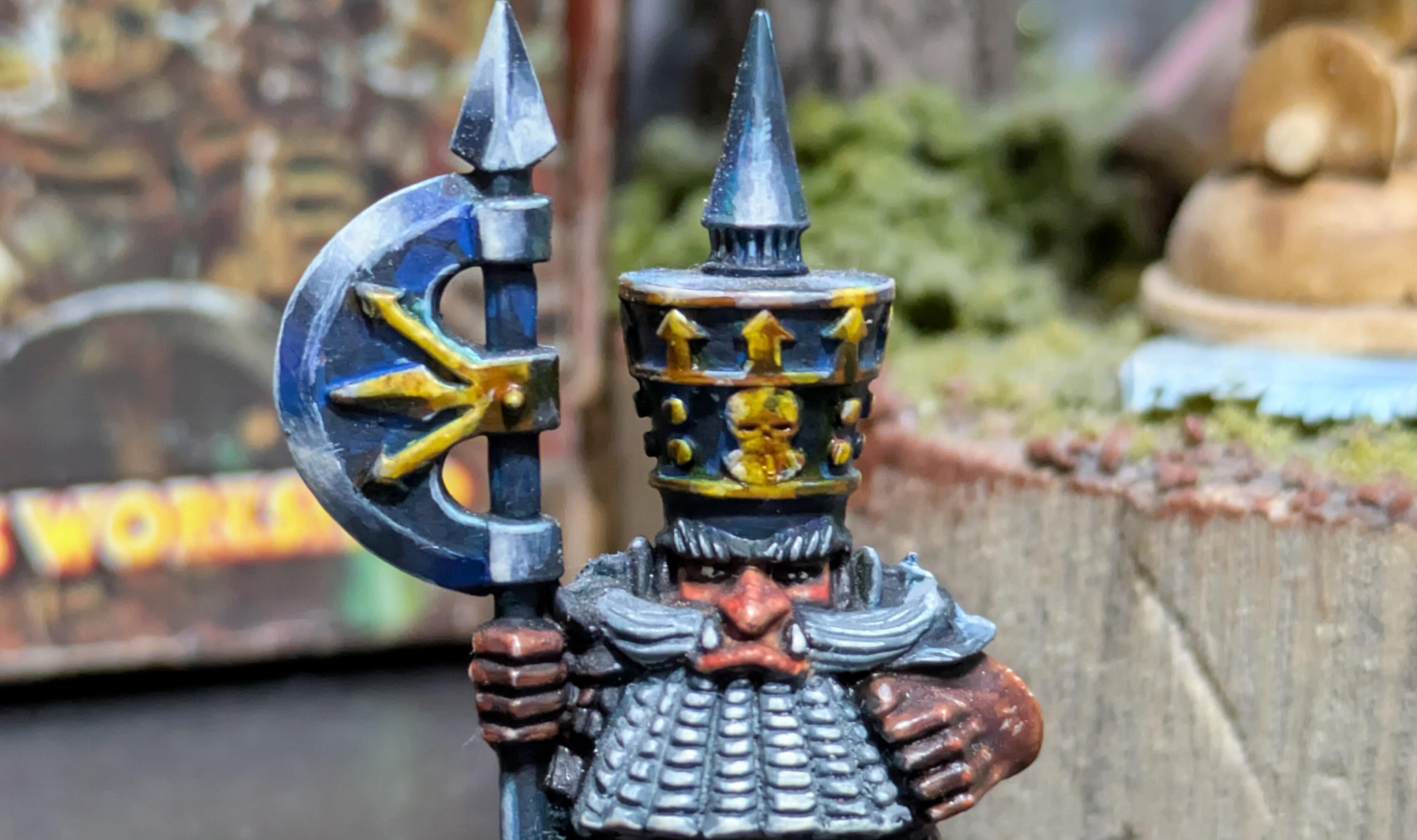
Mordheim is darkness that clings to the skin. It’s the cursed city where every stone oozes misery, where every glance speaks volumes about the horrors witnessed. When I painted these two warbands—the Dwarf Treasure Hunters and the Sisters of Sigmar—I wanted them to breathe that atmosphere. No bright colors, no smooth finishes. Just the feeling of an oil painting, where light battles with darkness, where every brushstroke matters.---The Dwarf Treasure Hunters: Faces Carved by ShadowFor the dwarves, I focused entirely on faces and textures. No complicated recipes, no endless layers. Just a deep black base, almost like charcoal, and then glazes—transparent layers of paint—to bring out their features.- The eyes: A dull red or a muted orange, just enough to make their gaze pierce through the dark. No pure white, just a subtle glint, like a spark in the gloom.
- The fabrics: Muted tones—dirty gray, faded green, earthy brown—applied in patches and uneven strokes, as if their clothes had been worn down by years of hunting in Mordheim’s alleys.The idea? That each dwarf looks like they’ve stepped straight out of a romantic style painting: faces that tell a story, calloused hands, tangled beards. No vibrancy (in the "luminous" sense), just life as it is in Mordheim—harsh, dark, but full of character.---The Sisters of Sigmar: The Challenge of Non-Metallic MetalFor the Sisters, I chose Non-Metallic Metal (NMM). Not because it was the best option, but because I wanted to force myself to master the technique. And what better way than an entire warband to dive into it?- The armor: No shiny metal, but bluish grays, deep blacks, and subtle highlights—as if their armor were covered in a thin layer of soot and rust. I worked the reflections by following the shapes, imagining a light coming from above, weak and diffused.
- The effect: Armor that doesn’t shine, but catches just enough light to seem real in Mordheim’s darkness. As if it were damp from rain and mist, as if it had endured a thousand battles without ever being cleaned.---


The "Oil Painting" SpiritWhat interested me was capturing the essence of Mordheim with a painterly touch. Not hyper-detailed precision, but plays of light and shadow, textures that suggest more than they show.- Glazes to unify everything, to give that impression of layered strokes.building a painting step by step.
- Subtle highlights—just enough to make the miniatures stand out in the dark, but not so much that they look clean or new.
- A heavy atmosphere: Dark bases, washes that grime up the details, faces that seem plucked from a nightmare.
About
Hi, I’m Florian. Here, I share my passion for miniature painting—a world where tiny details bring big stories to life. Each piece is a labor of love, blending color, precision, and creativity.
This portfolio is a visual diary of my projects, experiments, and progress. Whether you’re a fellow hobbyist, a collector, or just curious about the art of miniature painting, I hope you enjoy exploring my work as much as I enjoy creating it.
Feel free to reach out if you’d like to collaborate, commission a piece, or just chat about all things miniatures!
Contact
Interested in a custom miniature or a creative collaboration? I’m currently open for commissions and projects. Fill out the form below or reach out directly—I’d love to hear your ideas!